SAP RealSpend: Anomaly Detection
UX Design, AI, Research
_
Not every problem machine learning touches is one it should own. Screened from dozens of ideas down to the one problem only ML could genuinely solve, Anomaly Detection shipped and was featured live at SAP Sapphire, before the GenAI hype.


Design Iterations & Learnings
Certainty, redrawn
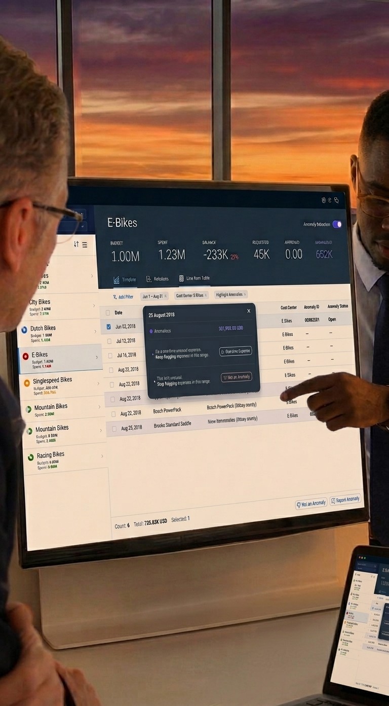
We designed the chart assuming flags were simply right or wrong: solid mustard fill on anything flagged, reading as certain. Validation proved otherwise, machine learning anomaly detection doesn't always return true positives, and the chart was overstating a certainty nobody had. We redrew it as a thin line: a hint to investigate, not a verdict to trust. We also tested surfacing the algorithm's calculation logic to build trust further, but it overcomplicated the UI. Instead, clicking a flag opens the underlying line item itself, so managers can judge for themselves without needing to understand the model.
Speaking the manager's language
"This app wasn't thought out to meet managers' vocabulary or way of thinking. It feels focused on controllers instead." (Manager, 45 years old, 5 years in the role)
Learning that, we rebuilt the chart's language around the manager. "Actual" became "Spent," a word managers already used. We dropped "Committed" entirely, redundant next to "Approved" for this audience. And we moved the anomaly indicator off mustard, a colour that reads as danger, onto a neutral tone in the product's own palette, so a flagged expense reads as worth a look.
Making the toggle visible
The detection toggle had the same visibility problem from a different angle: it lived below the chart, an area validation showed people barely noticed. It was important enough that people wanted to see it at a glance, so we moved it into the header, top right, next to the other primary controls.
Reporting, moved inline
The first version let managers flag a false anomaly back to the system over conventional email. It worked, technically, but validation showed people didn't want to leave the tool to do it. Three rounds of iteration moved reporting into the in-app digital assistant, with a confirmation that the report had been read. External experts at SAP Sapphire confirmed people wanted to investigate inline.
Cutting scope on the data
Smart Tagging tested weaker than the other two concepts on both desirability and feasibility, so we dropped it. Forecasting ranked higher on perceived value; Anomaly Detection came second. But the feasibility debate surfaced the deciding fact: Forecasting could plausibly be solved with non-ML statistical methods, weakening the case for spending ML effort there. Anomaly Detection was the harder problem, and the one only machine learning could genuinely address. The call came down to technical fit.
Reflections
Not everyone believed this would work. The loudest concern going in: over-alert, and managers would tune the feature out entirely, one more distraction from the job they were actually there to do.
A deeper risk sat underneath that one. The model worked probabilistically, comparing current spend against the same period in previous years, a baseline that broke down whenever a team had gone through a reorg. Getting it right depended on user feedback, and five requests in validation asked for exactly the failure mode I was worried about: let me dismiss an anomaly without training the algorithm on it.
A flat dismiss isn't enough. "Not an anomaly" can mean a one-timer, or it can mean stop flagging this pattern altogether, and collapsing both into a single button risks teaching the model to stop looking, even in the year it shouldn't.
Either way, the system still needed a signal. I pushed the team to design feedback options that captured which kind of "no" it was actually getting.
Good team collaboration builds momentum and saves rework: a shared understanding of the problem, and of where a feature sits in the bigger picture, before jumping to solutions. That pays off even faster now, when misalignment compounds quickly once building starts. Paper prototyping specifically feels dated today, but the discipline behind it doesn't. Team collaboration and DesignOps have always mattered to me, and this project is a strength I want to keep carrying forward as roles keep blurring.

Evolving as a team
testimonials

Questions people usually ask
Expand all


(01)
Vellfire Calibration
Art Direction
What does complex, large-enterprise B2B SaaS experience actually give me, and would I still move fast enough for a smaller team?
How do I work when the brief isn't clear yet, and what part of the job do I enjoy most?
How do I actually strengthen a team, and will I get hands-on or mostly direct from a distance?
What did I do with the time between roles, where do I stand on AI, and what am I looking for next?
How has living abroad shaped me, both as a person and as a principal design lead?